# Understanding Tool Modes


> Kanvas Designer offers three modes: Default, Pencil, and Connector, which behave differently based on the context in which they are used. Learn how to interact with components and the canvas in each mode.


<!-- set of custom keyboard button classes -->
<link rel="stylesheet" href="https://unpkg.com/keyboard-css@1.2.4/dist/css/main.min.css" />
Kanvas Designer offers three modes: Default, Pencil, and Connector, which behave differently based on the context in which they are used. Understanding these modes is essential for effectively interacting with components and the canvas.

You can switch between mouse modes using hotkeys or tool selection. Here are hotkeys that control your mode:

| Hotkeys                                                          | Description                                                                 |
|------------------------------------------------------------------|-----------------------------------------------------------------------------|
| <button class="kbc-button kbc-button-xs">Spacebar</button>       | Temporarily enables the alternative mouse mode (default mode vs pan mode)  |
| <button class="kbc-button kbc-button-xs">H</button>              | Switches to pan mode (hand icon)                                           |
| <button class="kbc-button kbc-button-xs">Escape / V</button>     | Switches to default mode irrespective of which mode you are currently using.|

## Interacting with Components


<ul class="nav nav-tabs" id="tabs-0" role="tablist">
  <li class="nav-item">
      <button class="nav-link active"
          id="tabs-00-00-tab" data-bs-toggle="tab" data-bs-target="#tabs-00-00" role="tab"
          data-td-tp-persist="select tool" aria-controls="tabs-00-00" aria-selected="true">
        Select Tool
      </button>
    </li><li class="nav-item">
      <button class="nav-link"
          id="tabs-00-01-tab" data-bs-toggle="tab" data-bs-target="#tabs-00-01" role="tab"
          data-td-tp-persist="pencil tool" aria-controls="tabs-00-01" aria-selected="false">
        Pencil Tool
      </button>
    </li><li class="nav-item">
      <button class="nav-link"
          id="tabs-00-02-tab" data-bs-toggle="tab" data-bs-target="#tabs-00-02" role="tab"
          data-td-tp-persist="pen tool" aria-controls="tabs-00-02" aria-selected="false">
        Pen Tool
      </button>
    </li><li class="nav-item">
      <button class="nav-link"
          id="tabs-00-03-tab" data-bs-toggle="tab" data-bs-target="#tabs-00-03" role="tab"
          data-td-tp-persist="pan tool" aria-controls="tabs-00-03" aria-selected="false">
        Pan Tool
      </button>
    </li>
</ul>

<div class="tab-content" id="tabs-0-content">
    <div class="tab-body tab-pane fade show active"
        id="tabs-00-00" role="tabpanel" aria-labelled-by="tabs-00-00-tab" tabindex="0">
        <table>
  <thead>
      <tr>
          <th>Action</th>
          <th>Cursor Style</th>
          <th>Behavior</th>
          <th>Example</th>
      </tr>
  </thead>
  <tbody>
      <tr>
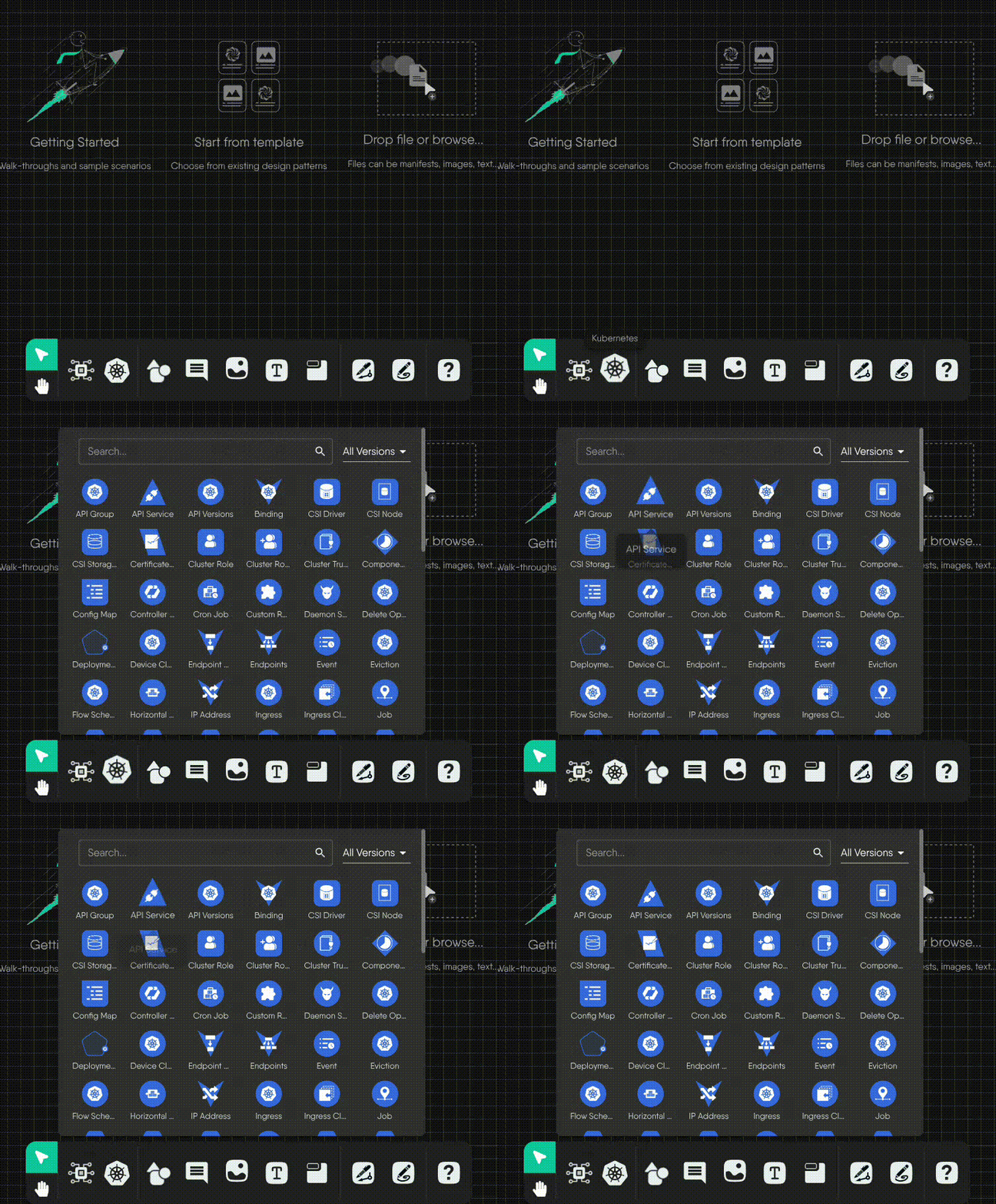
          <td><strong>Hover</strong></td>
          <td><code>default (arrow)</code></td>
          <td>Nothing</td>
          <td>


<div class="md__image">
  <img src="images/default.gif" onclick="openModal(this)" alt="Click"
  class="md-image-responsive" />
</div>
</td>
      </tr>
      <tr>
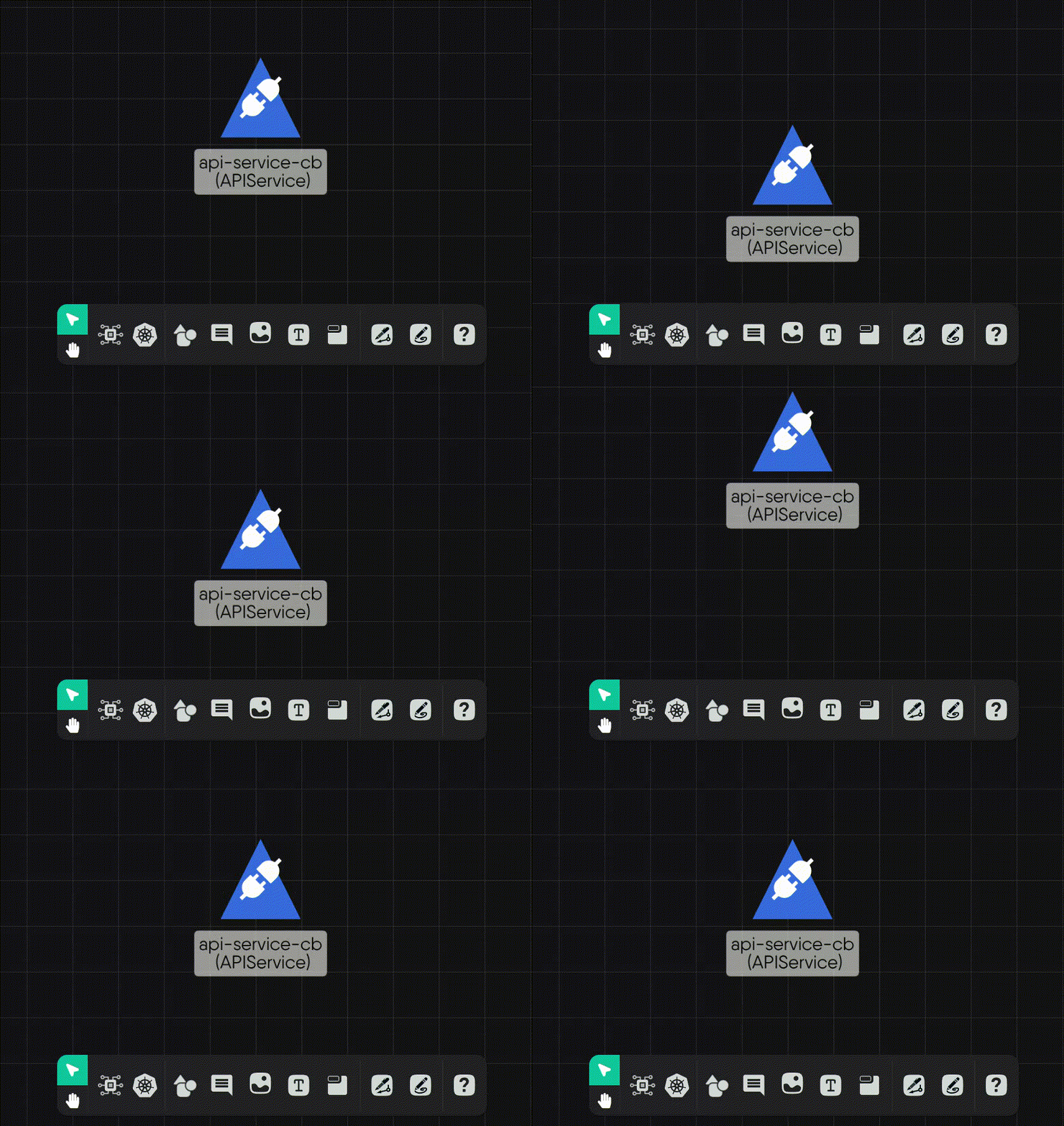
          <td><strong>Click-and-drag</strong></td>
          <td><code>move</code></td>
          <td>Moves component in the direction of the mouse</td>
          <td>


<div class="md__image">
  <img src="images/click_and_drag.gif" onclick="openModal(this)" alt="Click and drag"
  class="md-image-responsive" />
</div>
</td>
      </tr>
      <tr>
          <td><strong>Click</strong></td>
          <td><code>default (arrow)</code></td>
          <td>Displays component toolbar, resize box, and connection handles</td>
          <td>


<div class="md__image">
  <picture>
    <source srcset="/contentimg/kanvas/designer/understanding-tool-modes/images/click_hu_e81bf5123ff045fd.webp" type="image/webp" width="1126" height="462">
    <img src="images/click.png" onclick="openModal(this)" alt="Click"
    width="1126" height="462"
    class="md-image-responsive" />
  </picture>
</div>
</td>
      </tr>
      <tr>
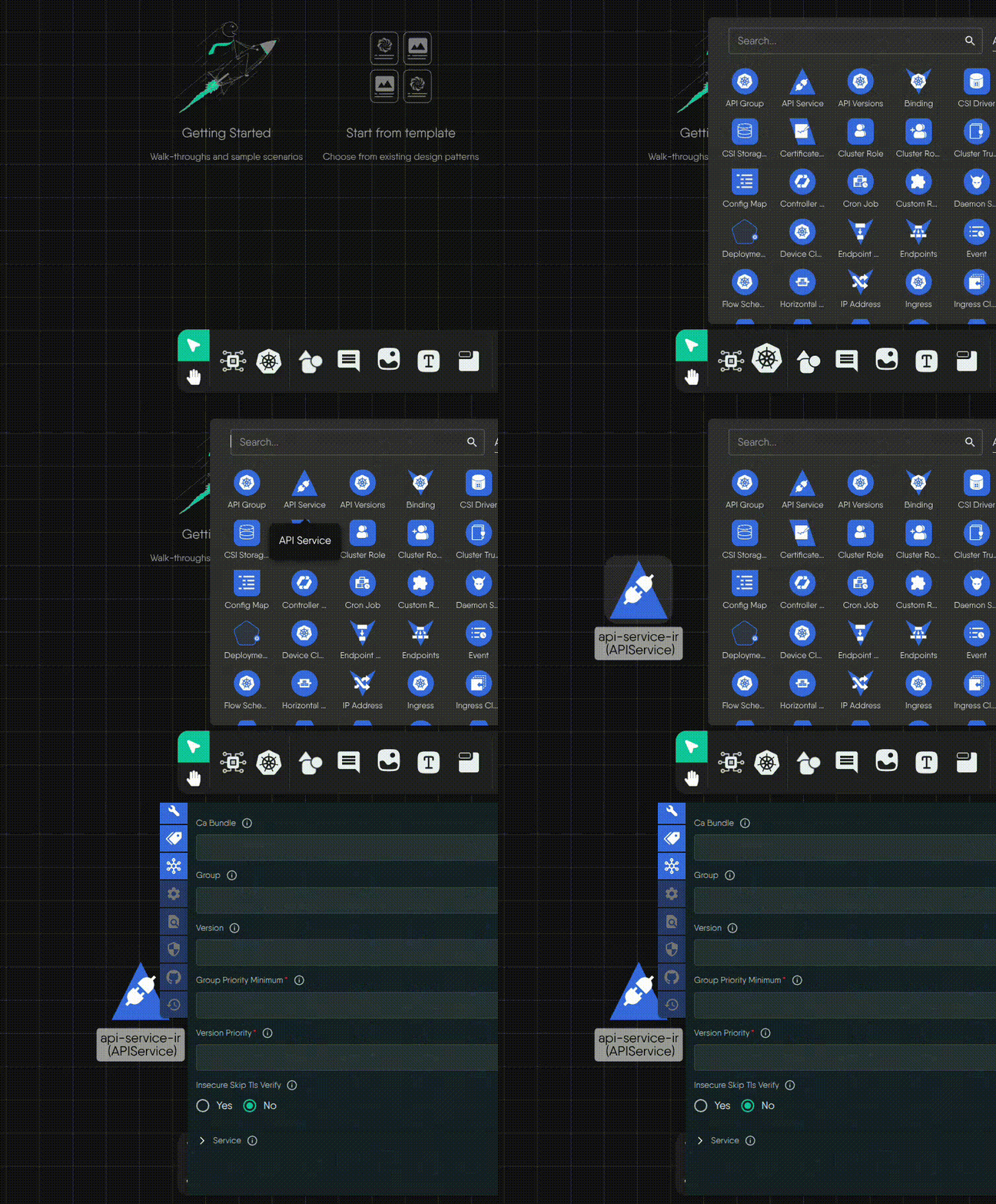
          <td><strong>Double-click (component)</strong></td>
          <td><code>pointer</code></td>
          <td>Opens the component configurator</td>
          <td>


<div class="md__image">
  <picture>
    <source srcset="/contentimg/kanvas/designer/understanding-tool-modes/images/double_click_hu_83b454c3a6721403.webp" type="image/webp" width="1286" height="1120">
    <img src="images/double_click.png" onclick="openModal(this)" alt="Double-click component"
    width="1286" height="1120"
    class="md-image-responsive" />
  </picture>
</div>
</td>
      </tr>
      <tr>
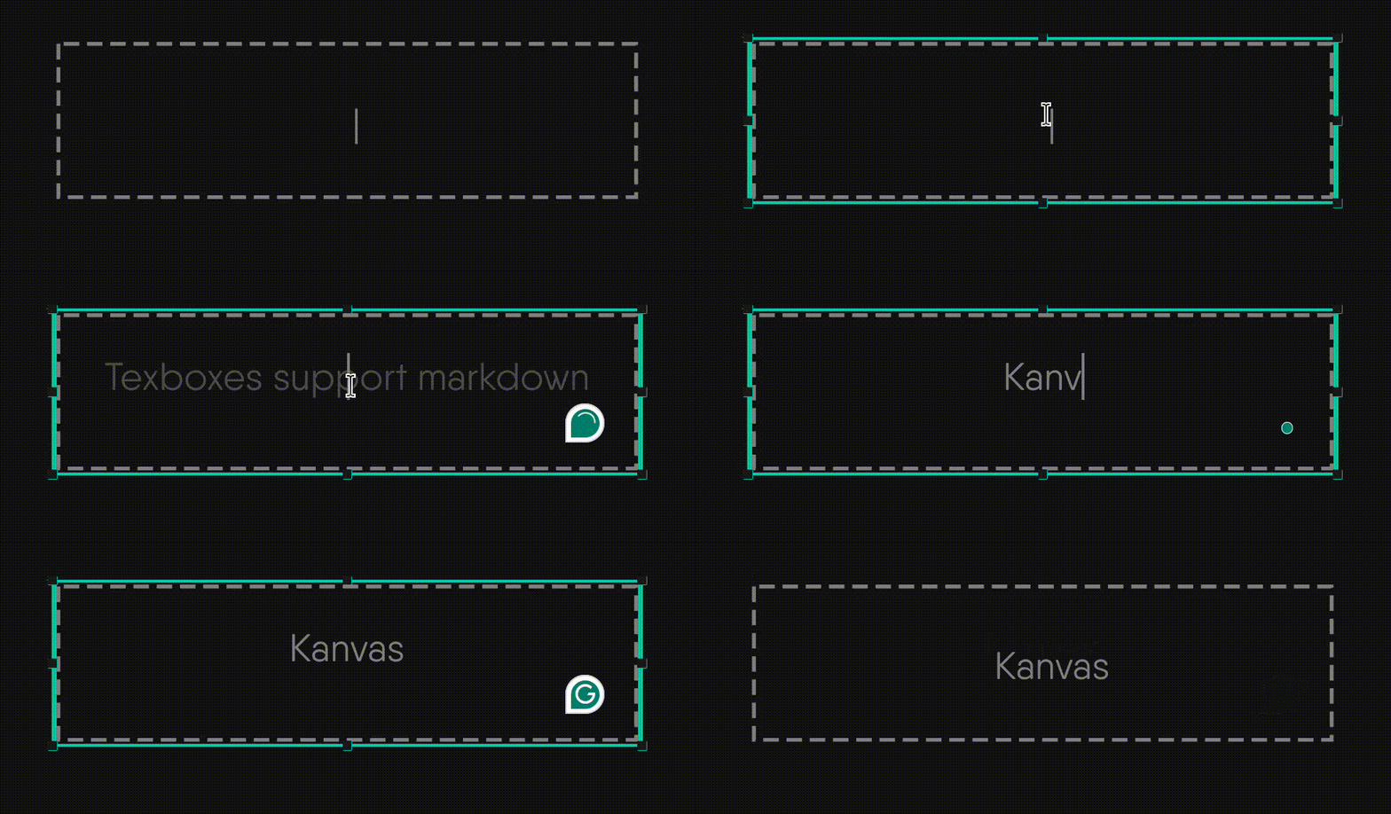
          <td><strong>Double-click (textbox)</strong></td>
          <td><code>text</code></td>
          <td>Enables text editing inside the component</td>
          <td>


<div class="md__image">
  <img src="images/text-box-double-click.gif" onclick="openModal(this)" alt="Double-click textbox"
  class="md-image-responsive" />
</div>
</td>
      </tr>
      <tr>
          <td><strong>Right-click</strong></td>
          <td><code>default (arrow)</code></td>
          <td>Opens the circular component context menu</td>
          <td>


<div class="md__image">
  <picture>
    <source srcset="/contentimg/kanvas/designer/understanding-tool-modes/images/right_click_hu_bc3b42b8509b13b4.webp" type="image/webp" width="743" height="702">
    <img src="images/right_click.png" onclick="openModal(this)" alt="Right-click"
    width="743" height="702"
    class="md-image-responsive" />
  </picture>
</div>
</td>
      </tr>
      <tr>
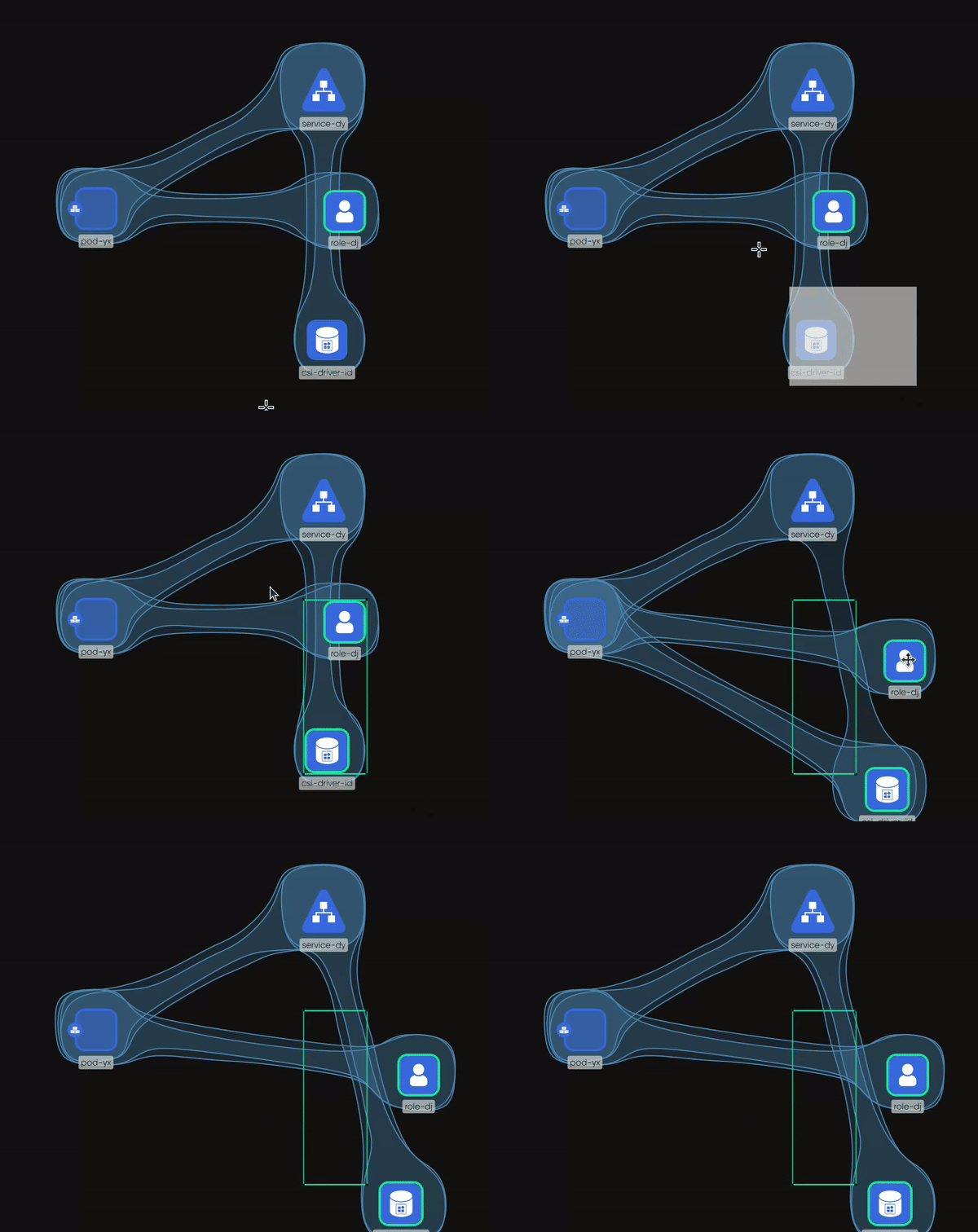
          <td><strong>Click-and-hold</strong></td>
          <td><code>crosshair</code></td>
          <td>Initiates box selection for selecting multiple components</td>
          <td>


<div class="md__image">
  <img src="images/select.gif" onclick="openModal(this)" alt="Box selection"
  class="md-image-responsive" />
</div>
</td>
      </tr>
      <tr>
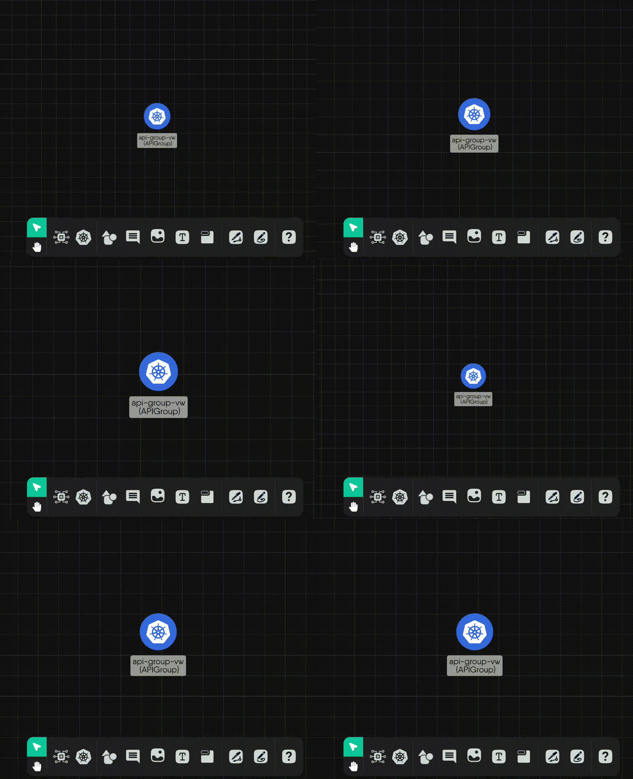
          <td><strong>Scroll wheel</strong></td>
          <td><code>default (arrow)</code></td>
          <td>Pan up or down</td>
          <td>


<div class="md__image">
  <img src="images/scroll_up_down.gif" onclick="openModal(this)" alt="Scroll"
  class="md-image-responsive" />
</div>
</td>
      </tr>
      <tr>
          <td><strong>Scroll wheel + CMD/CTRL</strong></td>
          <td><code>default (arrow)</code></td>
          <td>Zoom in/out</td>
          <td>


<div class="md__image">
  <img src="images/zoom_in_out.gif" onclick="openModal(this)" alt="Zoom"
  class="md-image-responsive" />
</div>
</td>
      </tr>
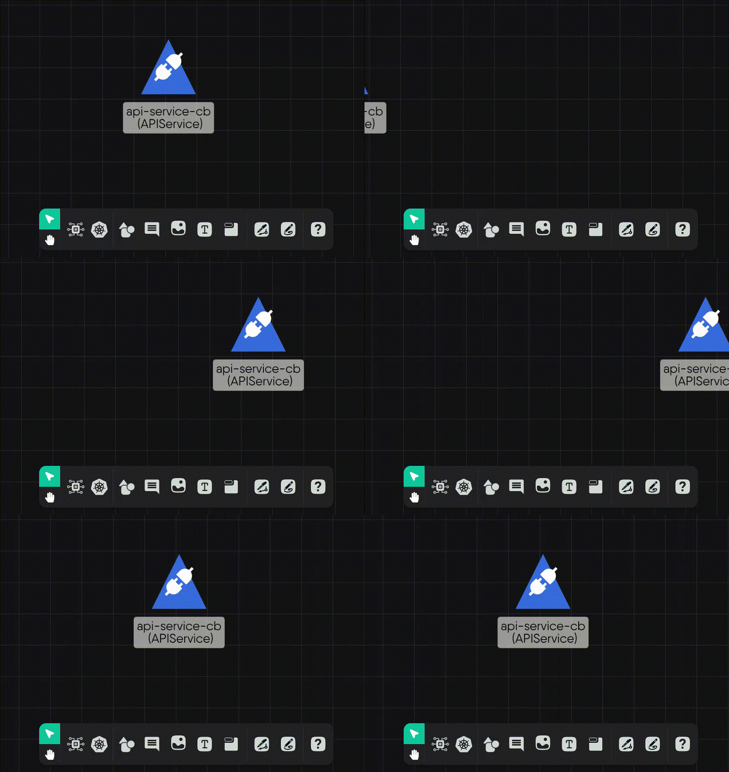
      <tr>
          <td><strong>Horizontal scroll wheel</strong></td>
          <td><code>default (arrow)</code></td>
          <td>Pan left or right</td>
          <td>


<div class="md__image">
  <img src="images/scroll_left_right.gif" onclick="openModal(this)" alt="Scroll left/right"
  class="md-image-responsive" />
</div>
</td>
      </tr>
  </tbody>
</table>

    </div>
    <div class="tab-body tab-pane fade"
        id="tabs-00-01" role="tabpanel" aria-labelled-by="tabs-00-01-tab" tabindex="0">
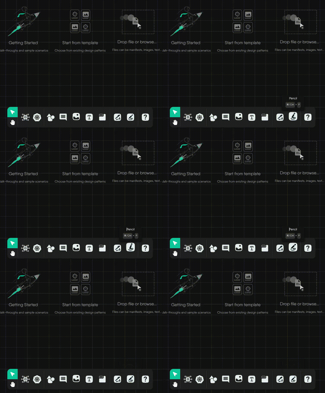
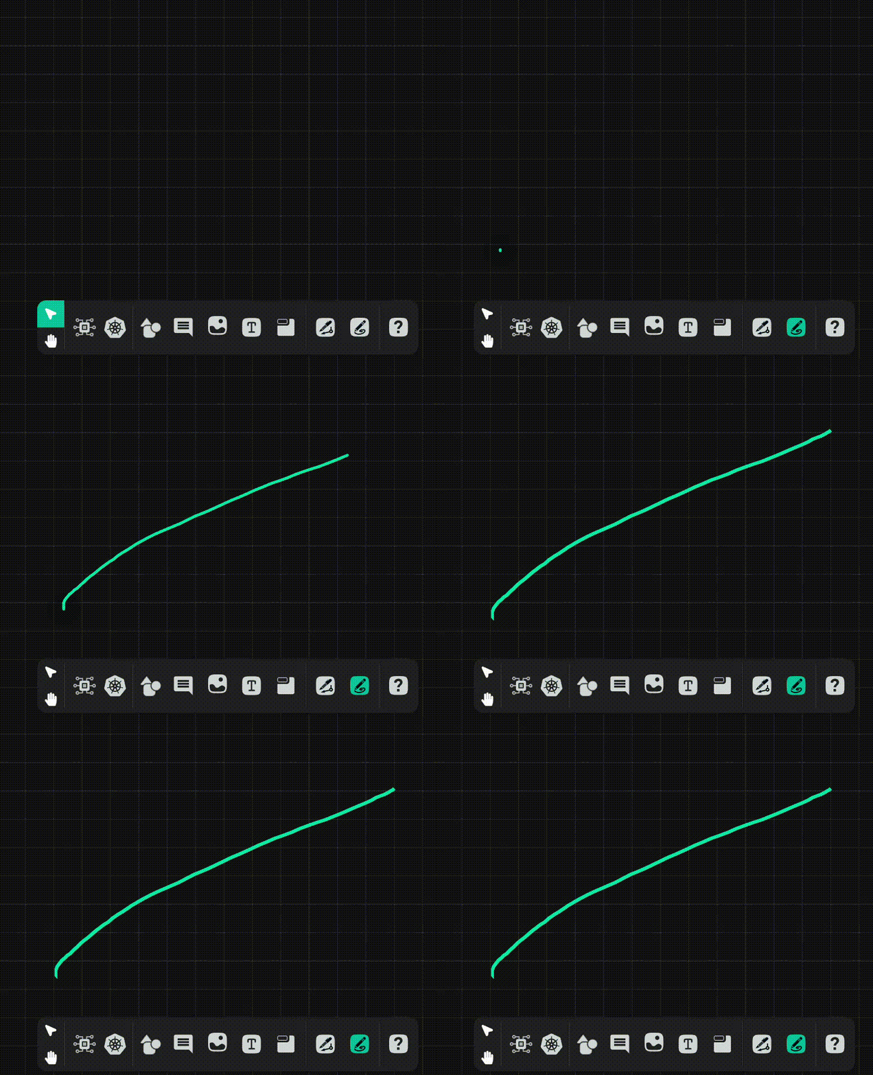
        <p>Pencil lines do not connect individual components, but offer annotating capability, allowing you to take notes and draw annotations to enhance your designs.</p>
<table>
  <thead>
      <tr>
          <th>Action</th>
          <th>Cursor Style</th>
          <th>Behavior</th>
          <th>Example</th>
      </tr>
  </thead>
  <tbody>
      <tr>
          <td><strong>Hover</strong></td>
          <td><code>custom(pencil)</code></td>
          <td>Nothing</td>
          <td>


<div class="md__image">
  <img src="images/pencil_hover.gif" onclick="openModal(this)" alt="Pencil hover"
  class="md-image-responsive" />
</div>
</td>
      </tr>
      <tr>
          <td><strong>Mouse down + drag</strong></td>
          <td><code>custom(pencil)</code></td>
          <td>Start drawing a freeform line</td>
          <td>


<div class="md__image">
  <img src="images/pencil.gif" onclick="openModal(this)" alt="Freeform line"
  class="md-image-responsive" />
</div>
</td>
      </tr>
      <tr>
          <td><strong>Mouse down + SHIFT</strong></td>
          <td><code>custom(pencil)</code></td>
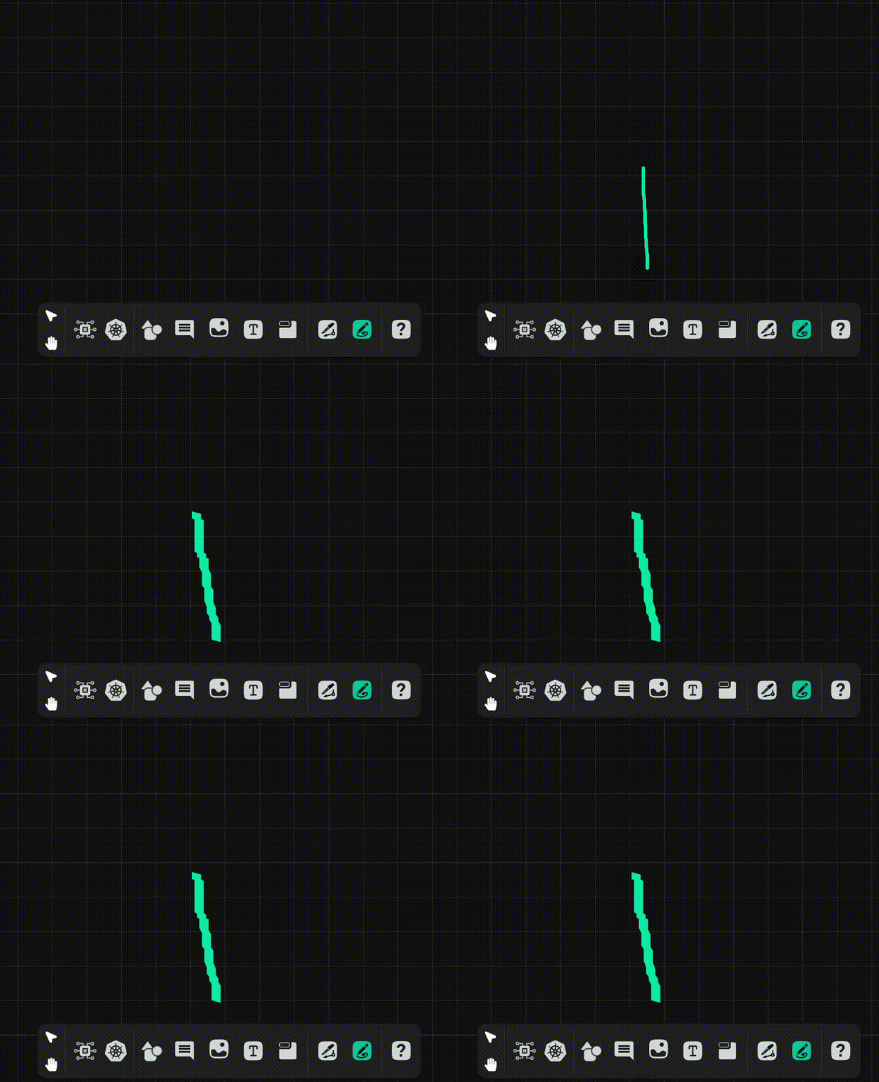
          <td>Start drawing a straight vertical or horizontal line</td>
          <td>


<div class="md__image">
  <img src="images/mouse_down_plus_shift.gif" onclick="openModal(this)" alt="Straight line"
  class="md-image-responsive" />
</div>
</td>
      </tr>
      <tr>
          <td><strong>Mouse up</strong></td>
          <td><code>custom(pencil)</code></td>
          <td>Complete the line and render into a styled component</td>
          <td>


<div class="md__image">
  <img src="images/mouse_up.gif" onclick="openModal(this)" alt="Mouse up"
  class="md-image-responsive" />
</div>
</td>
      </tr>
      <tr>
          <td><strong>Click</strong></td>
          <td><code>custom(pencil)</code></td>
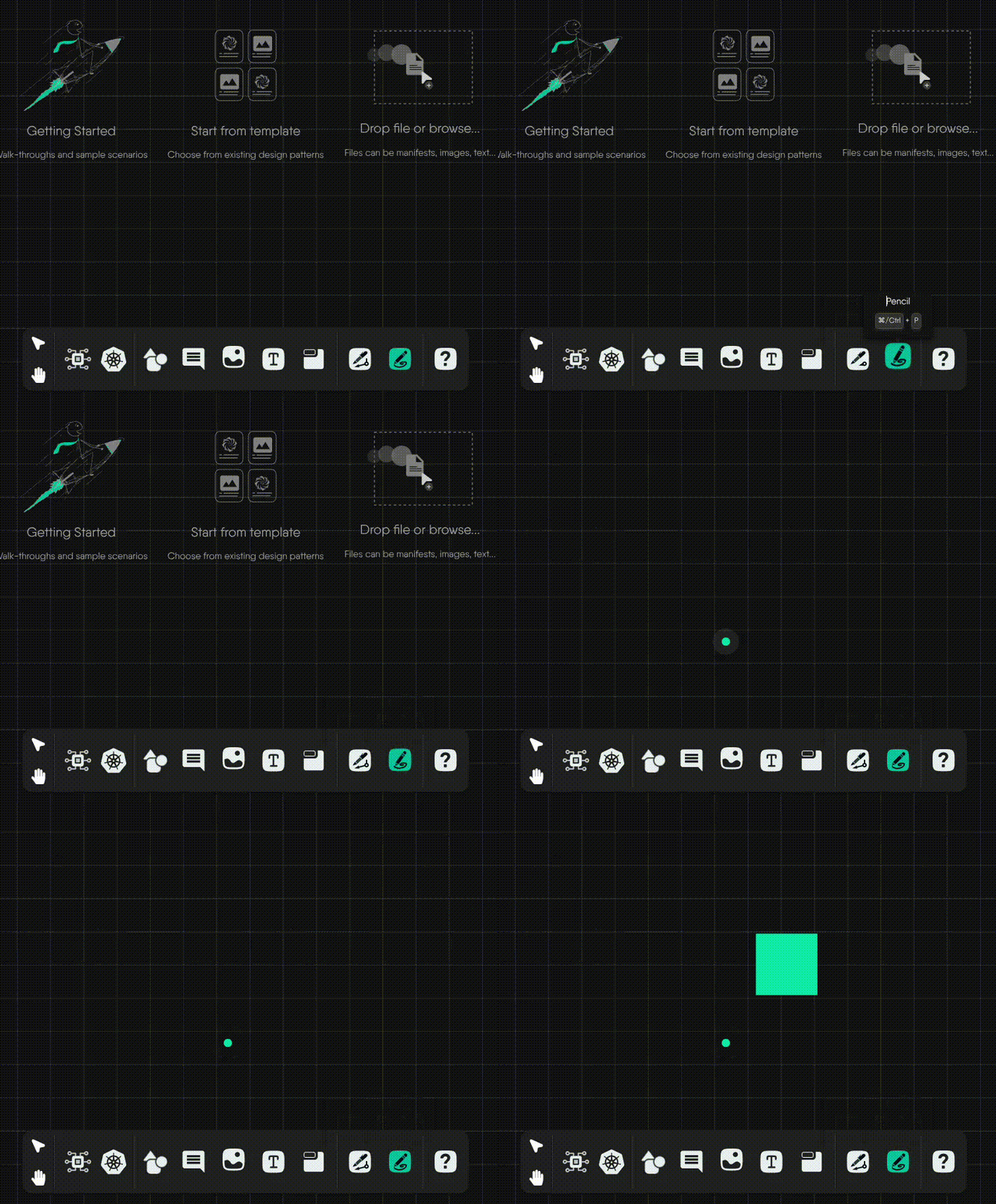
          <td>Draws ink from the pencil</td>
          <td>


<div class="md__image">
  <img src="images/pencil_ink.gif" onclick="openModal(this)" alt="Ink"
  class="md-image-responsive" />
</div>
</td>
      </tr>
      <tr>
          <td><strong>Scroll wheel</strong></td>
          <td><code>custom(pencil)</code></td>
          <td>Nothing</td>
          <td>


<div class="md__image">
  <img src="images/mouse_down.gif" onclick="openModal(this)" alt="Mouse down"
  class="md-image-responsive" />
</div>
</td>
      </tr>
      <tr>
          <td><strong>Scroll wheel + CMD/CTRL</strong></td>
          <td><code>custom(pencil)</code></td>
          <td>Nothing</td>
          <td>


<div class="md__image">
  <img src="images/zoom_in_out.gif" onclick="openModal(this)" alt="Zoom"
  class="md-image-responsive" />
</div>
</td>
      </tr>
  </tbody>
</table>
<!-- *Developer notes:*
1. *In the future, the canvas moves with the pen/pencil as they near the edge of the viewport.*
2. *In the future, the scroll wheel will behave as it normally does in default mode.* -->

    </div>
    <div class="tab-body tab-pane fade"
        id="tabs-00-02" role="tabpanel" aria-labelled-by="tabs-00-02-tab" tabindex="0">
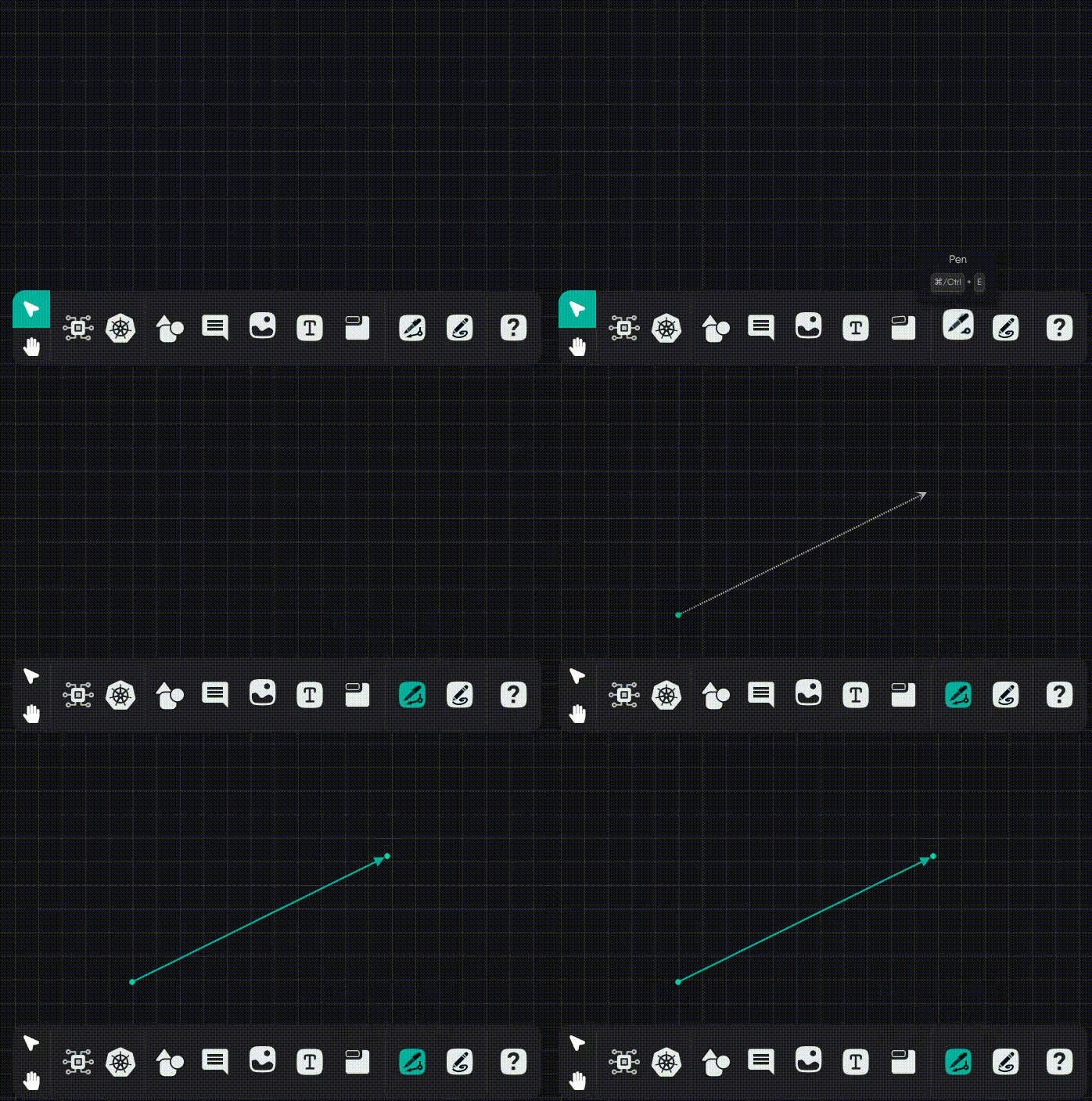
        <p>The Pen tool operates as a creator of annotation edges. Note that the pen tool has two behaviors depending upon the context in which you initiate the connection.</p>
<p><strong>To Activate:</strong> <code>(CMD/CTRL)+E</code></p>
<details>
<summary><strong>Connector Behaviors</strong></summary>
<ul>
<li><strong>Component-connect Behavior</strong>: When you click an empty spot on the canvas, and drag to another empty spot on the canvas, you get a joint (aka a terminal node) from which you can create new connections as well as new edge relationships.</li>
<li><strong>Canvas-connect Behavior</strong>: When you click an empty spot on the canvas, and drag to an existing component, you get an annotation edge relationship.</li>
</ul>
</details>
<table>
  <thead>
      <tr>
          <th>Phase</th>
          <th>Cursor Style</th>
          <th>Behavior</th>
          <th>Example</th>
      </tr>
  </thead>
  <tbody>
      <tr>
          <td><strong>1. Click &amp; release</strong></td>
          <td><code>pen</code></td>
          <td>Initiate connection</td>
          <td>


<div class="md__image">
  <img src="images/click_release_ptm.gif" onclick="openModal(this)" alt="Phase 1"
  class="md-image-responsive" />
</div>
</td>
      </tr>
      <tr>
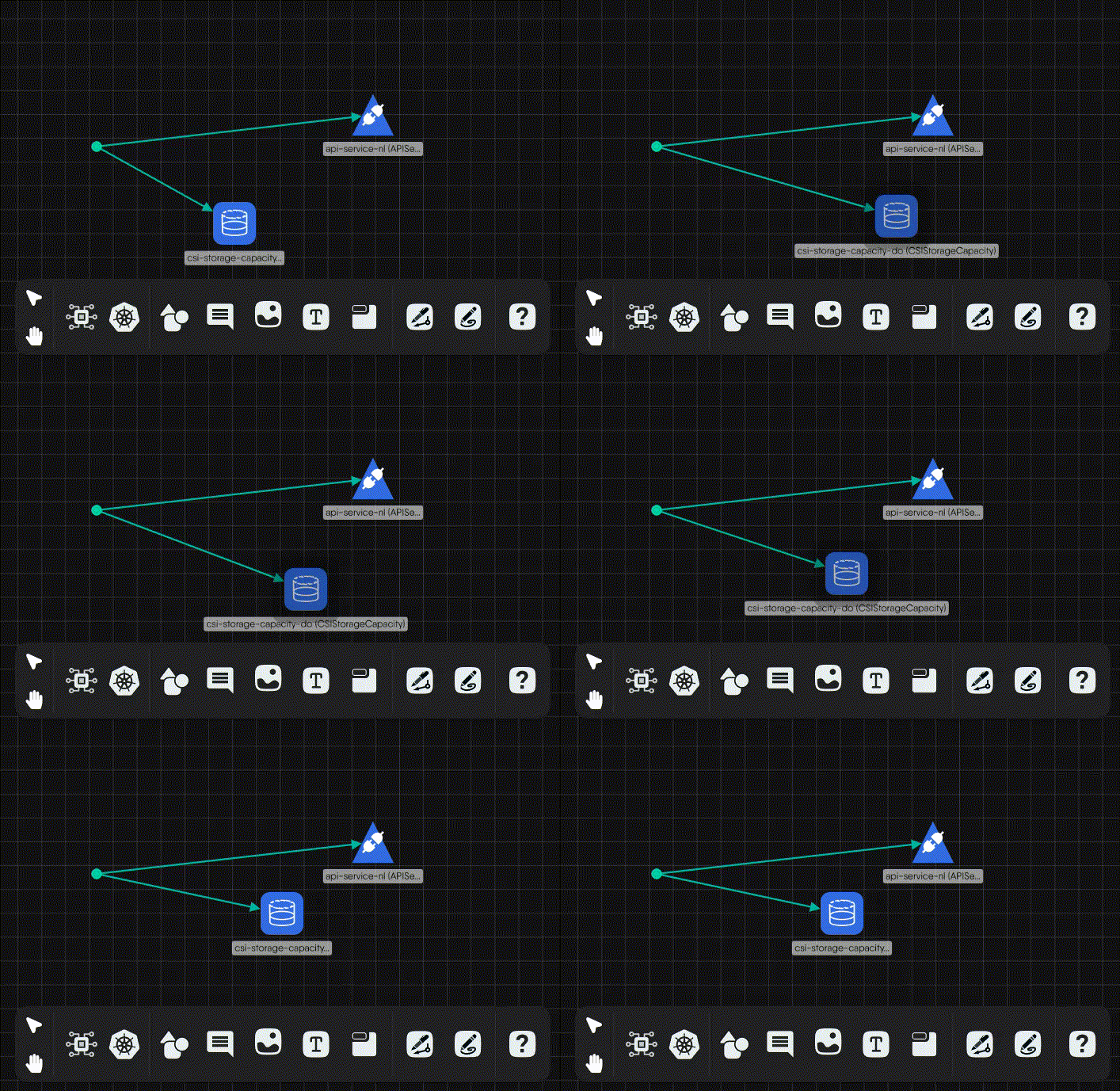
          <td><strong>2. Click-and-move</strong></td>
          <td><code>pen</code></td>
          <td>Move the ghost edge around if a connection was initiated</td>
          <td>


<div class="md__image">
  <img src="images/click_move_ptm.gif" onclick="openModal(this)" alt="Phase 2"
  class="md-image-responsive" />
</div>
</td>
      </tr>
      <tr>
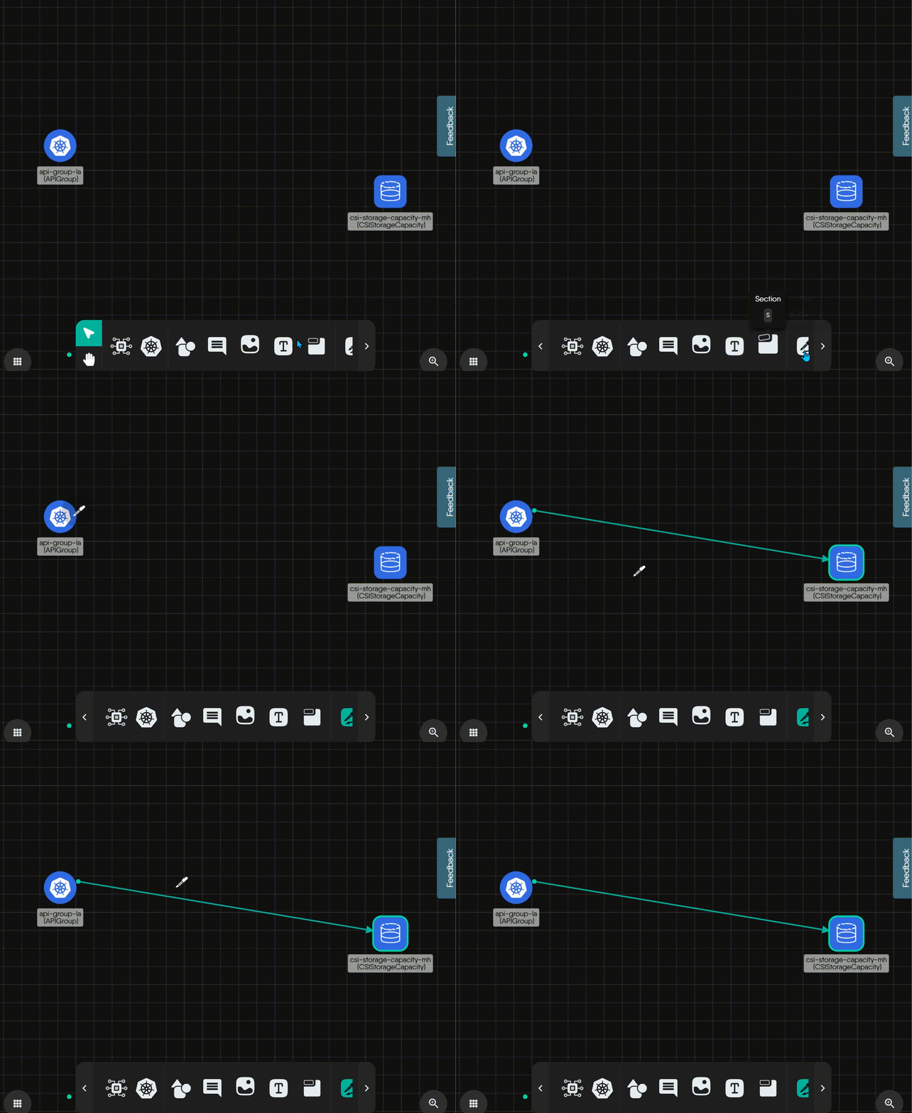
          <td><strong>3. Click while connecting</strong></td>
          <td><code>pen</code></td>
          <td>Establish and render the connection</td>
          <td>


<div class="md__image">
  <img src="images/click_while_connecting_ptm.gif" onclick="openModal(this)" alt="Phase 3"
  class="md-image-responsive" />
</div>
</td>
      </tr>
  </tbody>
</table>
<!--
*Developer notes:*
1. *In future, when the connector is released on an empty spot on the canvas, offer a component picker from which users can always choose a “Joint” component.*
2. *Rename PenTerminalNode to “**Joint**”, unless there’s something better to call it.*
-->

    </div>
    <div class="tab-body tab-pane fade"
        id="tabs-00-03" role="tabpanel" aria-labelled-by="tabs-00-03-tab" tabindex="0">
        <p>The table below outlines the mouse interaction modes available in <strong>Kanvas</strong> while using, detailing cursor styles and their expected behavior.</p>
<table>
  <thead>
      <tr>
          <th>Action</th>
          <th>Cursor Style</th>
          <th>Behavior</th>
      </tr>
  </thead>
  <tbody>
      <tr>
          <td><strong>Hover</strong></td>
          <td><code>hand</code></td>
          <td>Nothing</td>
      </tr>
      <tr>
          <td><strong>Click-and-hold</strong></td>
          <td><code>grabbing-hand</code></td>
          <td>Grab the canvas and pan in the direction of mouse movement</td>
      </tr>
      <tr>
          <td><strong>Scroll wheel + CMD/CTRL</strong></td>
          <td><code>grabbing-hand</code></td>
          <td>Zoom in/out in the direction of the mouse</td>
      </tr>
      <tr>
          <td><strong>Horizontal scroll wheel</strong></td>
          <td><code>grabbing-hand</code></td>
          <td>Pan left or right in the direction of the mouse</td>
      </tr>
  </tbody>
</table>

    </div>
</div>