Layout and Layers
Categories:
Two controls decide how a design reads on screen. Layout arranges the components - where they sit relative to one another. Layers decide which of them are drawn at all.
Both are recorded in the design rather than in your browser, so they travel with it: a layout writes the components’ positions, and the Layers panel writes their visibility into the design’s preferences. Anyone else opening the design sees the same arrangement and the same components hidden. What neither touches is configuration - a hidden component is still part of the design and is still deployed, and re-running a layout changes only where components sit.
Change design layout 🔗
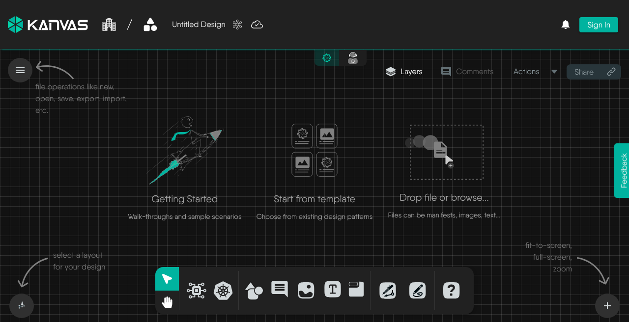
The layout control sits in the bottom-left corner of the canvas, showing the icon of the layout currently in use. Clicking it fans out the available layouts; picking one re-arranges every component on the canvas with an animated transition, so you can see where things moved to. The zoom controls sit at the opposite corner, bottom-right.
| Layout | Shape it produces | Suits |
|---|---|---|
| Constrained | A force-directed arrangement that respects grouping and containment | The default, and the best general-purpose choice |
| Grid | Even rows and columns | Inventories and flat sets of similar components |
| Hierarchical | A layered, top-down tree following the direction of relationships | Designs with a clear flow, such as ingress to service to workload |
| Star | Concentric rings around the most connected components | Finding the hubs in a design |
| Bus | A breadth-first arrangement fanning out from a root | Tracing what a component reaches, level by level |
| Ring | A single circle | Small designs, and comparing components at a glance |
A design opened for the first time uses the Constrained layout. Once you drag components by hand, those positions are what the design stores; re-running a layout overwrites them for everyone, so use undo if an automatic arrangement was not what you wanted.
Layouts on large designs
Re-running a layout across a very large design is the most expensive operation on the canvas. If a design is slow to arrange, see Performance Limits and Tuning.Configure visible layers 🔗
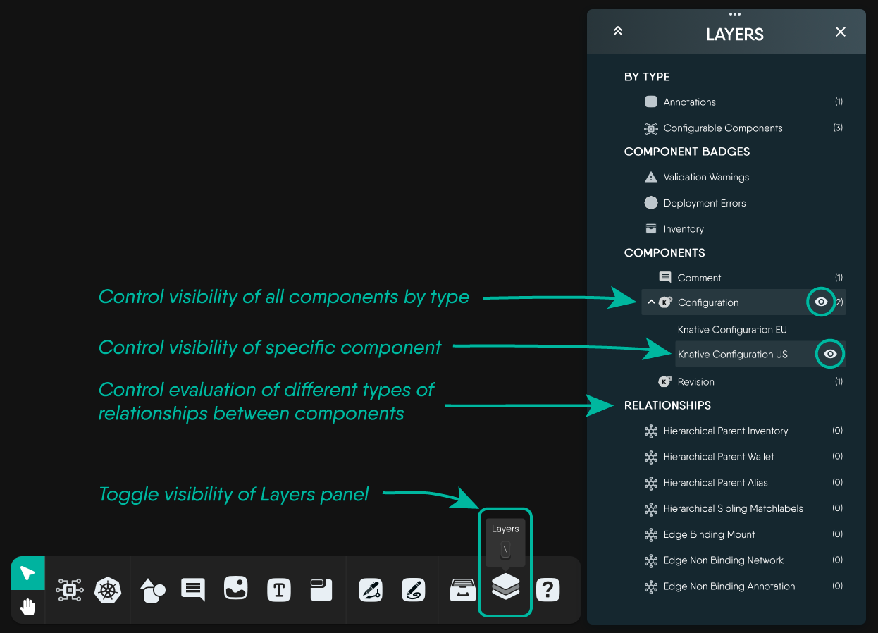
The Layers panel controls what the canvas draws. Open it from the Layers button in the toolbar above the canvas, beside Comments, Actions and Share. Every entry has an eye toggle: switch it off and that entity disappears from the canvas until you switch it back on.
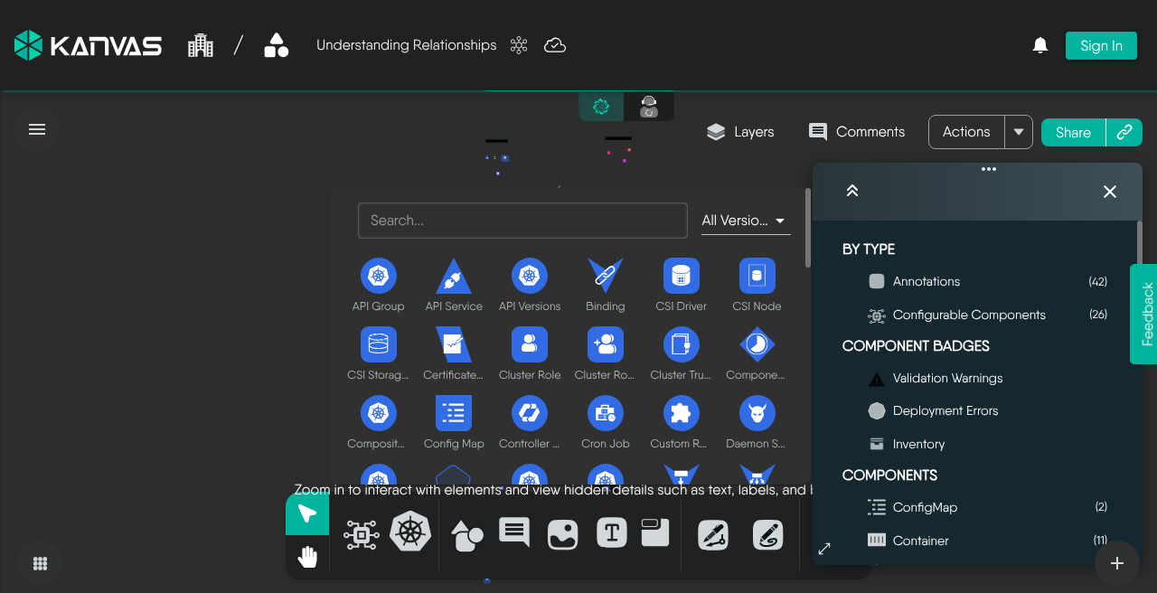
In Designer mode the panel is organized into four sections:
- By type - a single toggle each for Annotations (comments, shapes, text and other non-semantic components) and Configurable Components (the semantic components that actually get deployed). Turning annotations off is the fastest way to see the deployable shape of a design on its own. The count beside each is the number of components of that type in the design.
- Component Badges - Validation Warnings, Deployment Errors and Inventory badges. These are the small markers Kanvas draws on components; hiding them declutters a design that is mid-review. See Interpreting Component Badges.
- Components - every kind present in the design, grouped by model. Expanding a group lists the individual components, each with its own visibility toggle, so you can hide one Deployment without hiding the rest. Clicking a component’s name selects it on the canvas and zooms the view to it.
- Relationships - each relationship kind, type and subtype found in the design, with its own toggle and a count. TagSet relationships appear here under that name.
The header of the panel expands or collapses every section at once.
Because visibility travels with the design, the Layers panel is a way of presenting a design as much as a way of reading one - hide the noise before you hand a design to someone else and they will open it the way you left it.
Layers in Operator mode
The Layers panel is present in Operator mode too, but it filters rather than hides: instead of design components it lists the Kubernetes resource kinds MeshSync has discovered - Cluster, Workloads, Configurations, Networking, Storage, Monitoring and Custom Resources - and choosing among them changes which resources are fetched and drawn. Those choices are what a saved view records.Render mode 🔗
Layout and layers decide what is drawn and where. Render mode, in the Options drawer, decides how much detail each component is drawn with - from full fidelity down to a wireframe - and can be set to adapt automatically as a design grows. Reach for it when a design has become large enough that panning and zooming feel heavy.
Related Reading
- Canvas Actions
- Cloning a Design
- Configuring Components
- Creating Relationships
- Deleting a Design
- Deploying Designs


Recent Discussions on Kanvas
- Jul 12 | Unleash Visual Power: Import Your Configs by zihan kuang
- Oct 14 | Explore Meshery's Published Relationship Design Examples by Awani Alero
- Oct 03 | Design Review RFC: Kanvas Empty State Enhancement by Lee Calcote
- Jul 19 | [For Discussion] Visual indication of semantically vs non-semantically meaningful Meshery components by Lee Calcote
- Jun 07 | What are the conditions for a "System is unhealthy" warning? by James
- May 30 | Looking for a meshmate to help with first PR by Faisal Imtiyaz123
- Feb 28 | For Discussion: Capturing potential, but unrealized Relationships in Design Snapshots by Lee Calcote
- Feb 12 | Hint on Scaling & Verifying Cronjob in Playground by Sandra Ashipala